New website for Stanek Onions
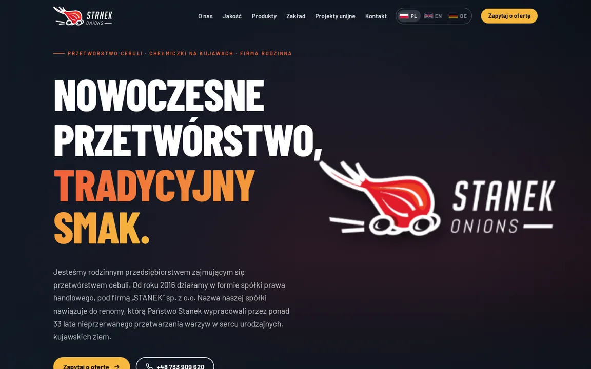
Content, photos, certificates and department contacts carried over in full from the current site. What is new is the shell: an opening animation, three languages (Polish, English, German), phone and desktop. Colours: the logo red on dark navy.
At the top: two logo animations taking turns
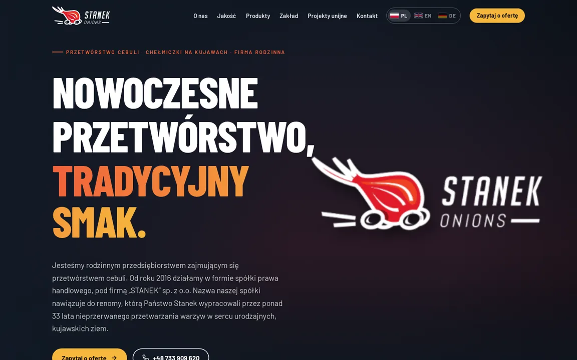
The drive-in and the line drawing play on their own, one after the other: first the onion on wheels drives in and away, then a glowing line draws the logo. No switch. The cards below open each one separately.
Further down: four proposals for the dark sections
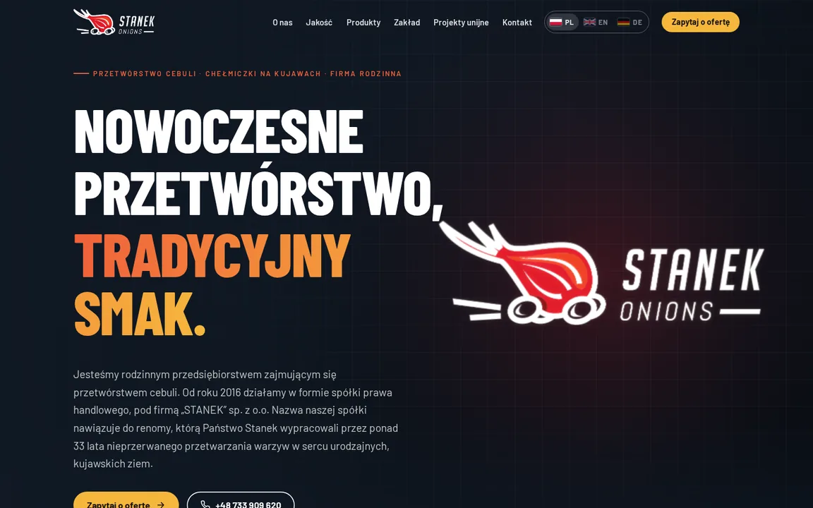
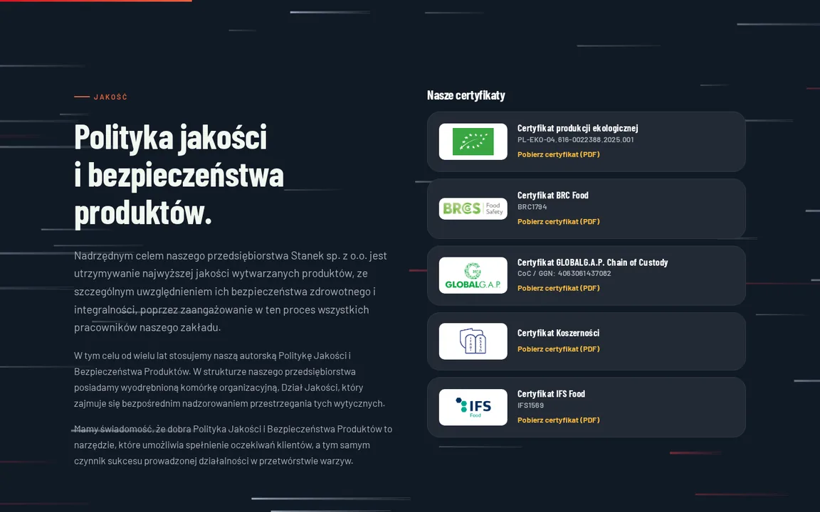
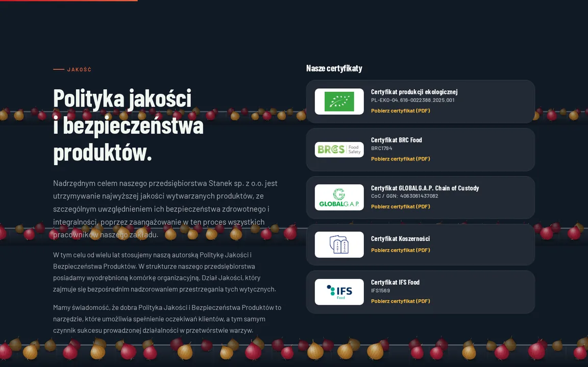
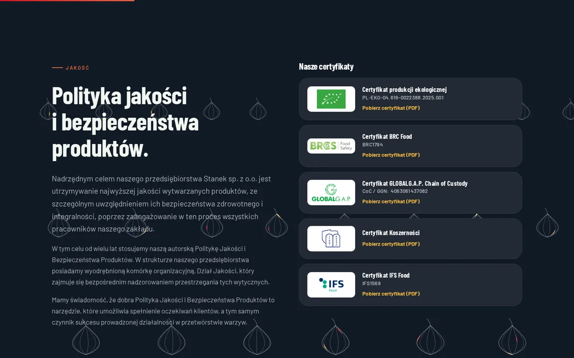
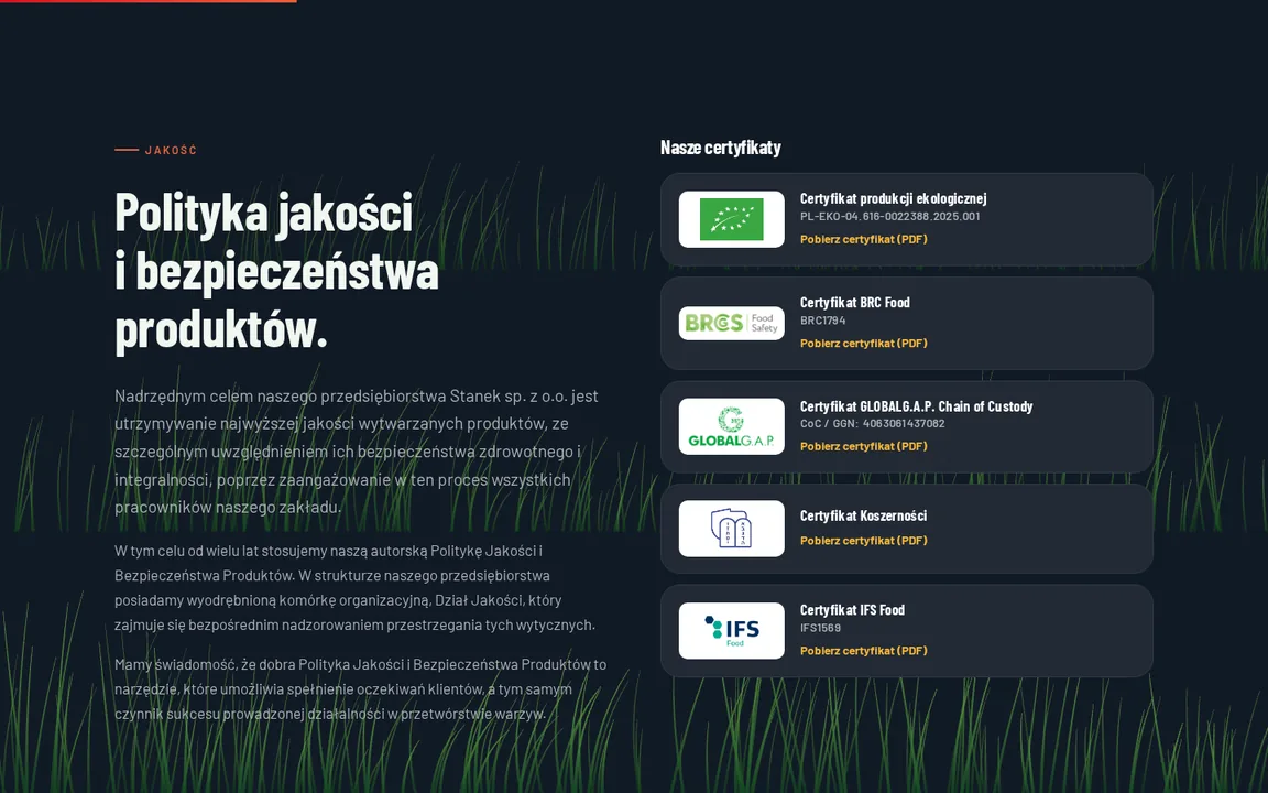
The dark sections (quality, facility, contact) get an animation across their whole background, like the roads on KG Transport: the content slides over it as you scroll, and cards and photos cover it. On the site the "Background" switch sits in the bottom right corner and the choice is remembered. It only runs while a dark section is on screen.
Proposals for a decision
Things that beg to be added but are not on the current site. None of this was done quietly.
Proposal 01Customer reviews from GoogleThe current site has no reviews. If the company has a Google profile with reviews, we will add a section with quotes (in the original, with the source noted).
Proposal 02Company video on the pageThe old site links out to YouTube. The video can be embedded directly in the About section, with its own opening frame.
Proposal 03Form sent from the serverToday the form opens your e-mail program with a ready-made message to the chosen department. Sending straight from the page needs a small server-side script.
Proposal 04Certificate numbers to checkThe Polish and English versions of the current site give different BRC (BRC1794 / BRC1307) and IFS (IFS1569 / IFS1071) numbers. We carried over the Polish ones; the attached PDFs are current.
Proposal 05Two product pages to tidyThe current site lists "Shallots in skins" twice and the "Onion rings" tab has nothing but a photo. We dropped the duplicate; the rings have the short note from that page.
Proposal 06Careers tabThe company employs drivers and production staff, yet the site has no information about jobs. A simple section with an address for CVs would do.
What every version includes
Three languagesPolish, English and German. A switch with flags in the menu and the footer, the active language is highlighted.
Phone and desktopChecked in both layouts, no sideways scrolling.
Content unchangedOffer, certificates (with PDFs), the EU project and department contacts one to one from the current site.
Working version, hidden from search engines. Design: Optizo.